
PDP Upsells styles customization
The PDP Bundle Upsell block supports visual customization so merchants can match it to their store theme. This document covers all available settings and CSS variables.
You can refer to this documentation on how to create bundle upsells: How to set up bundle upsells in Simple Bundles
How it works
The PDP Bundle Upsell block in the Shopify theme editor includes color pickers, a CTA style preset, layout controls, and a Custom CSS textarea. Each layer builds on the previous one.
The priority order:
- Defaults - the widget inherits the theme's font and text color; buttons ship in black and white
- Color pickers & layout settings - visual settings in the theme editor (heading color, sale price color, CTA button color, CTA style, layout, columns)
- Custom CSS - anything in the textarea wins over all of the above
How to apply
Color pickers (recommended)
In the Shopify theme editor:
- Go to Theme > Customize and open the product page template
- Select the PDP Bundle Upsell block
- Use the color pickers and CTA style dropdown to match the store theme
- Save
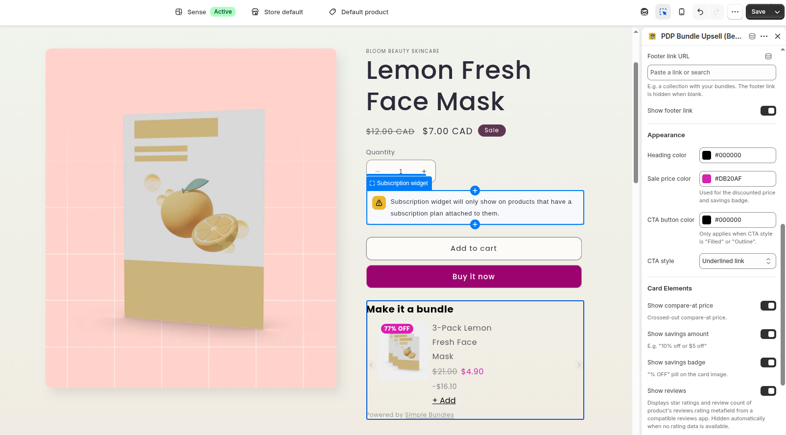
Available pickers:
| Setting | Default | What it controls |
|---|---|---|
| Heading color | #000000 |
Block heading |
| Sale price color | #D92D20 |
Discounted price and the savings badge |
| CTA button color | #000000 |
Button background (Filled), border (Outline), or link color (Underlined link) |
| CTA style | Underlined link | Filled / Outline / Underlined link button appearance |
Custom CSS (advanced)
For fine-grained control beyond the color pickers, use the Custom CSS textarea. Paste a CSS block targeting .pdp-bundle-upsell :
.pdp-bundle-upsell {
  --pdp-bundle-upsell-button-color: #2563eb;
  --pdp-bundle-upsell-radius: 8px;
}
Only include the variables you want to change - everything else keeps its default or the theme editor setting.
Variables reference
Core variables
Most customizations only need these. The color variables are also controllable via the theme editor pickers.
| Variable | Default | What it controls |
|---|---|---|
--pdp-bundle-upsell-heading-color |
inherit | Block heading text |
--pdp-bundle-upsell-button-color |
#000 |
CTA background (Filled), border (Outline), link color (Underlined link) |
--pdp-bundle-upsell-btn-text-color |
#fff |
Text on Filled buttons and on the savings badge |
--pdp-bundle-upsell-sale-price-color |
#D92D20 |
Sale price text and savings badge background |
--pdp-bundle-upsell-radius |
6px |
Corner radius for Filled and Outline buttons |
Card & layout variables
| Variable | Default | What it controls |
|---|---|---|
--pdp-bundle-upsell-image-size |
120px |
Max width/height of the bundle image |
--pdp-bundle-upsell-gap |
1rem |
Spacing between cards (also drives grid column and carousel page width math) |
--pdp-bundle-upsell-muted-color |
inherits text color | Secondary text — subheading, compare-at price, savings amount, review count |
--pdp-bundle-upsell-star-color |
inherits text color | Review stars (fill and outline) |
Note: Grid columns and carousel page size are already controlled by the block's "Number of columns" and "Maximum bundles to show" settings. No need to set those via CSS.
Note: Secondary text keeps a built-in opacity (60–75%) even when you set
--pdp-bundle-upsell-muted-color, so pick the color with that in mind — or overrideopacityper class in Custom CSS.
CTA style presets
The "CTA style" dropdown in the block settings provides three built-in looks. Custom CSS overrides whichever preset is selected.
- Underlined link (default) - plain underlined text, no background
- Filled - solid button in the CTA color with contrasting text
- Outline - transparent button with a CTA-colored border
Recipes
Quick rebrand (just set 2 variables)
.pdp-bundle-upsell {
  --pdp-bundle-upsell-button-color: #2563eb;
  --pdp-bundle-upsell-radius: 10px;
}
Match a store theme
Find the store's colors in the Shopify theme settings or by inspecting the storefront. Shopify themes store colors as RGB triplets (e.g. 155,4,111 ). You can use them directly with rgb() :
.pdp-bundle-upsell {
  --pdp-bundle-upsell-button-color: rgb(155, 4, 111);
  --pdp-bundle-upsell-sale-price-color: rgb(155, 4, 111);
  --pdp-bundle-upsell-radius: 10px;
}
Gold review stars
.pdp-bundle-upsell {
  --pdp-bundle-upsell-star-color: #f5a623;
}
Bigger images, tighter cards
.pdp-bundle-upsell {
  --pdp-bundle-upsell-image-size: 160px;
  --pdp-bundle-upsell-gap: 0.5rem;
}
Softer secondary text
.pdp-bundle-upsell {
  --pdp-bundle-upsell-muted-color: #8a7468;
}
Beyond variables - target elements directly
Every element carries a stable class, so anything the variables don't cover can be styled directly in the Custom CSS textarea. Examples:
/* Card border */
.pdp-bundle-upsell__item {
  border: 1px solid #e5e5e5;
  border-radius: 8px;
  padding: 0.75rem;
}

/* Hide the savings badge on mobile */
@media (max-width: 749px) {
  .pdp-bundle-upsell__savings-badge {
    display: none;
  }
}

/* Style the carousel arrows */
.pdp-bundle-upsell-carousel__arrow {
  background: #fff;
  border: 1px solid #d1d1d1;
}
Key classes: .pdp-bundle-upsell__heading , __subheading , __items , __item , __image , __title , __price , __price--sale , __compare-at-price , __savings-amount , __savings-badge , __rating , __stars , __star (+ --filled ), __rating-value , __button (+ --filled , --outline , --underlined-link ), __footer-link , and .pdp-bundle-upsell-carousel__arrow (+ --prev , --next ).
Tips
- Start with the color pickers - most stores only need to set the heading, sale price, and CTA button colors in the theme editor. No CSS needed.
- Use Custom CSS for fine-tuning - override radius, image size, gap, or star color when the pickers aren't enough.
- Keep contrast accessible - when changing
--pdp-bundle-upsell-button-color, make sure--pdp-bundle-upsell-btn-text-colorstill reads against it (dark button + white text works best). The same pair applies to the savings badge.